
You have about three seconds to win a shopper’s attention. That is all the time a cereal box gets before a hand reaches for a different brand. Most boxes look the same. They blend into a noisy shelf full of bright colors and bold claims. The real problem is not taste or price. It is getting noticed before the customer walks away.
Vintage-themed boxes solve that problem through smart design. They use color, shape, and simple text to stop the eye. Vintage-themed boxes also build trust fast when they look professional. In this guide, you will learn how shelf appeal works. We will cover color psychology, real branding tips, and packaging mistakes to avoid. You will walk away with practical steps you can use today.
Why Buyer Attention Matters on Shelves?

First Glance Can Win the Sale
A shopper decides in three seconds. That is not an exaggeration. I have watched people scan cereal aisles like robots. They do not read the ingredients first. They look for a box that pops. If your box blends in, you lose. Printed cereal boxes are your only shot at that first look. No second chance. No salesperson to help. Just cardboard and design.
Buyer attention packaging changes everything. A tired parent or a picky kid will grab what feels familiar or fun. Your box is the first brand touchpoint. It speaks before you do. I have seen small brands win shelf space just by fixing their colors and fonts. No ad spend. No coupon. Just a box that said pick me. That is how shipping gift boxes turn a glance into a sale.
How Printed Cereal Boxes Grab Attention

Bright Colors and Shelf Impact
Cereal packaging design starts with color. A bright red or yellow box screams look at me. I once helped a brand swap its dull beige for a bold orange. Sales jumped in two weeks. Color also sets a mood. Blue feels healthy. Yellow feels fun. Green feels natural. Pick one feeling and own it.
Bold Typography That Gets Noticed
Large fonts win every time. A shopper does not squint to read your name. Eye-catching cereal boxes use big, clear words. Keep letters simple. No fancy scripts. I have seen tiny fonts lost to a bolder neighbor. That hurts. Your cereal name needs to pop from five feet away. Make it thick and readable.
Graphics That Build Instant Curiosity
Shelf appeal packaging needs a strong visual. A bowl of cereal. A funny cartoon. A simple pattern. Graphics tell a story fast. One client used a smiling spoon on their box. Kids grabbed it over organic brands. That is real power. Your picture should answer one question. AI helps brands packaging by testing visual ideas faster and shaping designs that look fun, clear, and easy to remember.
Branding Power of Printed Cereal Boxes
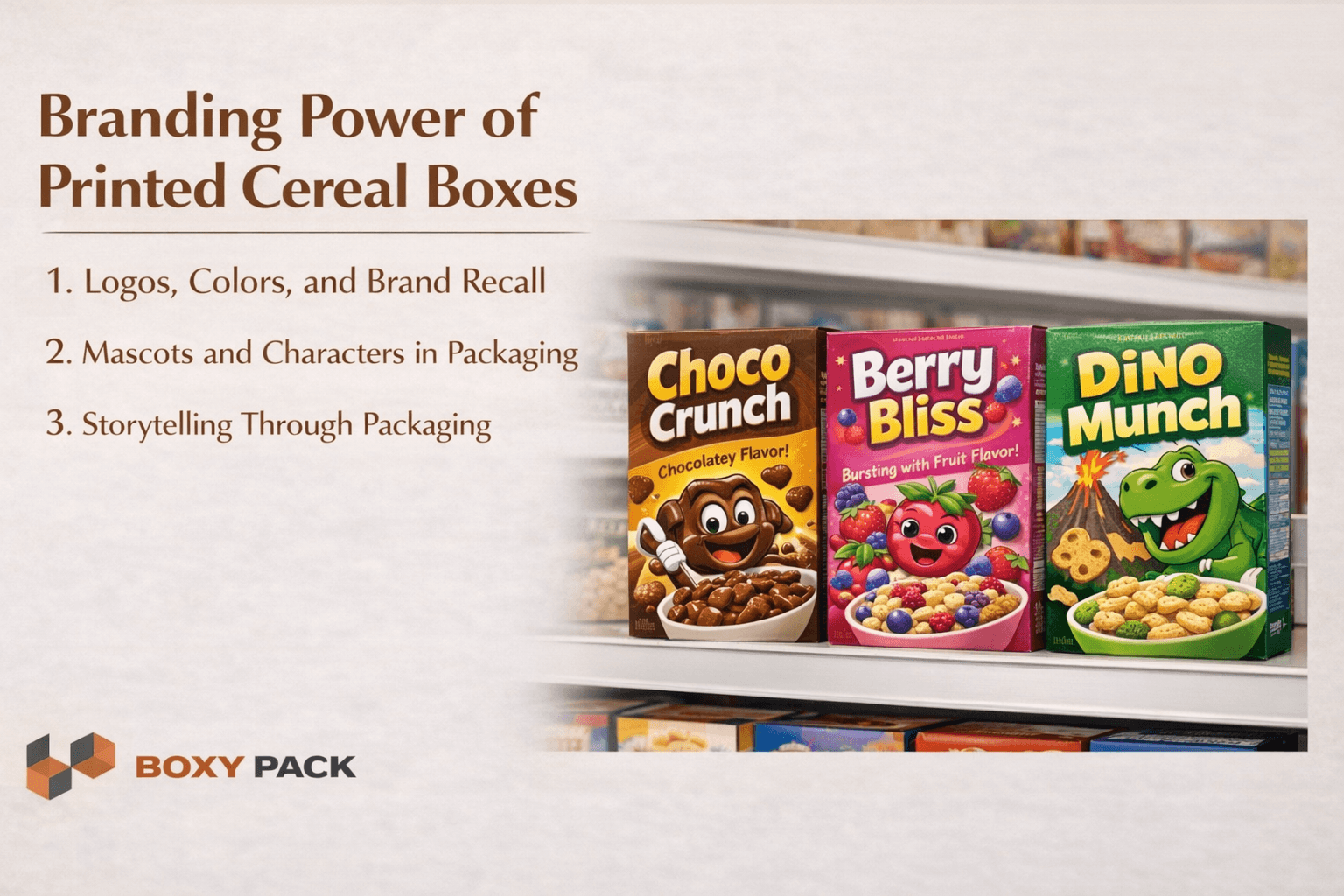
Logos, Colors, and Brand Recall
Cereal box branding works best when it stays the same. Use the same blue every time. Put your logo in the same spot. I have seen brands confuse shoppers by changing colors each month. That kills trust. Custom printed cereal boxes help people find you fast. Repeat buyers look for your look. Give them that comfort.
Mascots and Characters in Packaging
A good mascot feels like a friend. Kids remember a funny tiger or a silly bear. That emotional hook matters. I worked with a small brand that added a simple smiling bowl. Their repeat sales grew by thirty percent. Mascots do not need to be fancy. Just friendly and easy to spot.
Storytelling Through Packaging
Brand recognition grows when your box tells a story. Family breakfast. Morning fun. Healthy start. Pick one tale and show it. A box that says something real gets picked up more. That is your brand talking without a single word.
Printed Cereal Boxes That Boost Sales
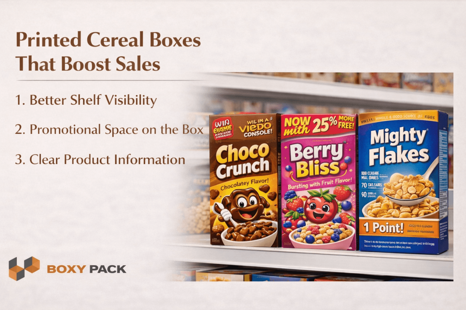
Better Shelf Visibility
Cereal boxes boost sales by standing up straight. A rectangular box faces the shopper perfectly. That is a small win. But it matters. I have seen round or flimsy packages get ignored. They fall over or hide. Your box needs to say hello from every angle. Strong shelf presence pushes impulse buys. A tired dad grabs what he sees first.
Promotional Space on the Box
Retail packaging boxes can sell more than cereal. Add a QR code for a coupon. Put a contest on the back. I once helped a brand add a simple spin-the-wheel game. Kids begged their parents to buy it. Limited-time offers work too. A sticker that says two dollars off creates urgency. That is one reason brands choose rigid boxes when they want packaging to feel stronger, more premium, and more persuasive.
Clear Product Information
Packaging that attracts customers tells the truth fast. Parents scan for sugar and fiber. Health shoppers look for whole grains. If your font is tiny, they move on. I have watched people flip boxes over for three seconds. Then they grab another brand. Make your nutrition bold. List benefits simply. That builds trust and closes the sale.
Design Features That Improve Attention

Box Shape and Structure
Custom cereal boxes do not need to be boring rectangles. A window box lets shoppers see the cereal. That builds trust. A die-cut shape like a bowl or a bear stands out fast. I once tested a round corner box against a standard one. The odd shape got picked up twice as often. Small changes win.
Interactive Packaging Ideas
Interactive cereal packaging keeps kids busy at breakfast. Add a maze on the back. Put a QR code that plays a short game. One brand I worked with added a collectible card inside. Families bought the same box for three months straight. That is real loyalty. Your box becomes a toy, not trash.
Premium Print and Finishing Options
Custom food boxes feel more valuable with a soft-touch finish. A little foil or embossing catches light on the shelf. I have seen a simple box look premium just by adding a glossy stripe. You do not need gold. Just one nice detail. That tells shoppers you care. And they will pay for that feeling.
Why Sustainability Also Attracts Buyers?
Eco Packaging Supports Modern Buying Decisions
Sustainable cereal packaging is not just good for the planet. It is good for your brand. I have watched shoppers put down a plastic-lined box and pick a paper one instead. That choice happens in seconds. Parents want to feel good about what they buy. A recyclable box gives them that feeling.
Sustainable cereal packaging builds trust without a single word
Recyclable boxes feel honest and modern to most shoppers
Eco-friendly packaging cuts waste and lifts your brand image
A simple recycled label can close a sale faster
Sustainable cereal packaging keeps customers coming back
Young buyers check for green symbols before they buy
Paper-based boxes cost little but add real loyalty
Common Mistakes That Reduce Attention

Weak Colors That Blend Into the Shelf
Cereal packaging design fails when you use safe, boring colors. A pale yellow box next to a bright orange one disappears. I have seen that mistake kill sales. Pick bold or go home.
Poor Typography That Is Hard To Read
Tiny cursive fonts look pretty but sell nothing. Shoppers do not have time to squint. If they cannot read your name in one second, they leave. Make letters big and simple.
Overcrowded Design With No Visual Focus
Too many pictures and words confuse the eye. Buyer attention packaging needs one main thing. Not ten. A cluttered box looks cheap and desperate. Clean space works better.
Inconsistent Branding Across Product Lines
One flavor uses red. Another uses green. No logo in the same spot. That breaks trust. Your customer gets lost. I have watched brands fix this and win.
Low Quality Printing That Reduces Perceived Value
Faded colors and blurry text scream bad product. Smudged ink feels gross. You lose the sale before they taste the cereal. Print well or do not print at all.
Printed Cereal Boxes for Retail Growth
Smart Packaging Supports Long-Term Sales
Printed cereal boxes do two jobs at once. They protect your product and sell it. I have seen small brands grow fast just by fixing their box design. Better printing means better trust. That trust turns into repeat buyers. Even a simple upgrade works. Custom cereal boxes make this process easier for food brands that want better shelf appeal and stronger brand value.
Printed cereal boxes build attention in under three seconds
Custom cereal boxes help you stand out from big competitors
Cereal boxes boost sales when colors and fonts are bold
Clean design keeps trust high and returns low
A good box turns one buyer into a loyal fan
Better printing supports every shelf, from small shops to big stores
Conclusion
Printed cereal boxes are not just containers. They are your best salesperson on the shelf. This guide showed how color typography and graphics grab a buyer's attention in packaging in three seconds. We found that bold design beats clutter every time. Consistent branding and simple product facts build real trust. Cereal packaging design also works better when you add interactive features or sustainable materials. These findings matter because most shoppers decide fast.
If your box blends in, you lose that sale. The future belongs to boxes that tell a clear story. Small upgrades like a brighter color or a readable font can double your shelf power. You do not need a big budget. Just smart choices. Start with one change this week. Test it on a small run. Watch how shoppers react. Then do more of what works. Ready to fix your box? Talk to Boxy Pack today.
FAQs
Q1: How do printed cereal boxes improve buyer attention?
They use bold colors and big fonts. That stops a shopper in three seconds flat.
Q2: What colors work best for cereal box packaging?
Bright reds and yellows grab kids. Blues and greens feel healthy for parents.
Q3: Why is branding important on cereal boxes?
Cereal box branding helps people find you again. The same look builds trust fast.
Q4: Can printed cereal boxes help increase sales?
Yes. A clear box that pops on shelves gets picked up more often.
Q5: Are sustainable cereal boxes good for branding?
Sustainable cereal packaging shows you care. Modern buyers love that honest green choice.
Ready to Get Started?
Discover our custom packaging solutions and bring your brand to life with premium boxes.