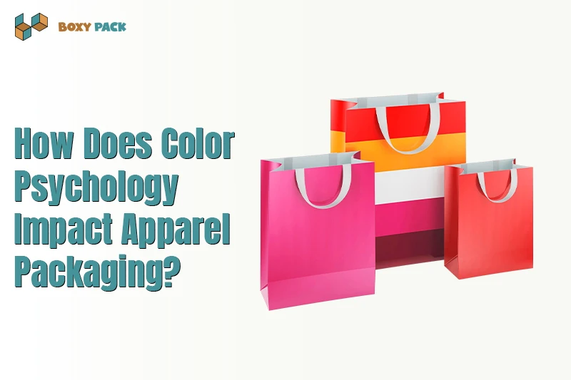
You just got a package from your favorite clothing brand. The box looks amazing. That is no accident. Color psychology impacts apparel packaging more than most sellers realize. But most brands get it wrong. They pick a color because it looks pretty. Then, customers feel nothing. Or worse, they feel confused. I have watched small shops waste money on bright pink boxes that hurt sales. A bad color choice kills trust before anyone opens the lid.
Here is the real fix. You need to match color to emotion, not just your logo. I will show you how top brands use this trick in high-end apparel boxes. First, we look at what each color actually does. Then we match those feelings to your ideal customer. Finally, I will give you a simple test for your next packaging run. No design degree required. Just honest choices that work.
Why Color Psychology Shapes Fashion Packaging?
Color psychology in packaging drives fast buyer reaction in fashion stores. Buyers often judge apparel packaging before checking product details. Strong shades help brands look clear and trusted. Weak color use creates mixed signals for shoppers. Good packaging color means it supports brand memory and repeat sales. Real fashion brands test color response before large product launches.
Colors shape the first brand opinion fast
Bright shades push quick buying action
Dark tones suggest premium apparel value
Clear color themes improve brand recall
Mixed colors reduce buyer trust quickly
Emotional Power of Packaging Colors
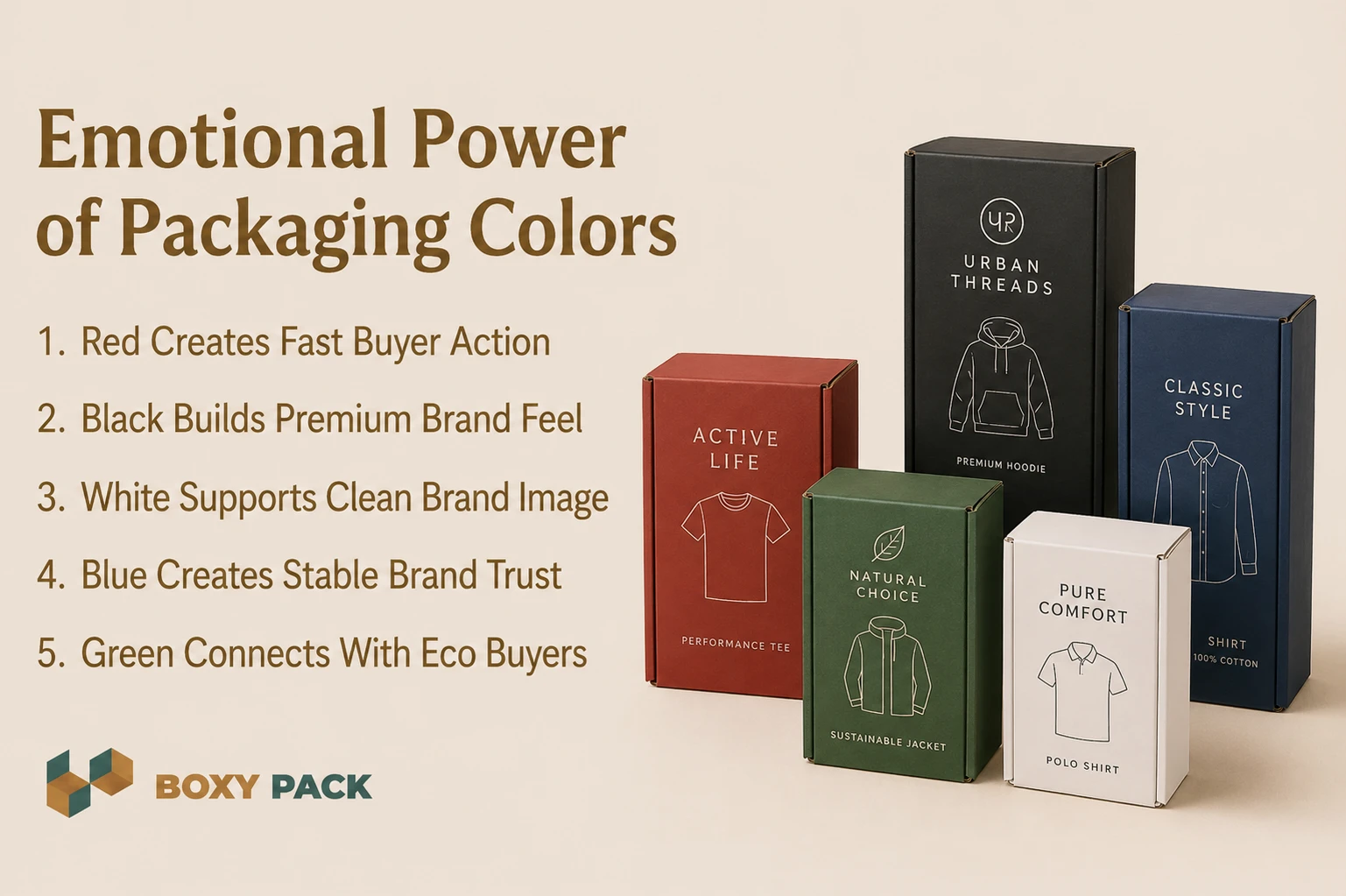
Red Creates Fast Buyer Action
Red draws quick attention in busy fashion spaces. Many sales boxes use red for this reason. It adds bold energy to best apparel packaging boxes and sparks a fast reaction. We often see younger buyers move faster toward red designs. Strong red tones also help streetwear brands stand out on crowded shelves.
Black Builds Premium Brand Feel
Black gives apparel packaging a rich and costly look. Luxury fashion brands use black to signal status and class. Matte black boxes feel more serious and sharp in hand. Emotional branding colors like black also improve product value in the buyer's eyes during first contact moments.
White Supports Clean Brand Image
White creates a calm and simple brand look. Minimal fashion brands often use white for trust and a clean display. It helps buyers focus on product details without visual noise. White fashion packaging boxes also work well with soft textures and neat logo placement in stores.
Blue Creates Stable Brand Trust
Blue helps fashion brands appear safe and steady. Many formal apparel brands use blue packaging for this reason. It gives buyers a sense of trust during product selection. Emotional branding colors like blue also support long-term brand memory through repeated store visits and online orders.
Green Connects With Eco Buyers
Green links apparel brands with nature and clean living. Sustainable clothing brands often use green shades in packaging design. Buyers now notice eco signals more than before. Green packaging shapes fashion brands by showing care for waste control and better material choices in modern retail markets.
How Apparel Brands Use Color Strategy
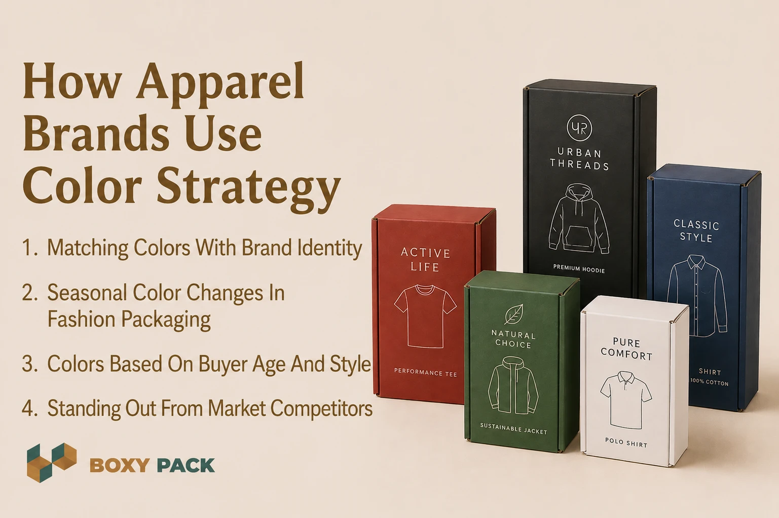
Matching Colors With Brand Identity
Smart brands plan packaging before the product launch starts. Color matching helps buyers recall the brand faster in stores. Good apparel box design ideas follow the same logo and tone rules. We often test print shades on real materials first. Screen colors and printed colors rarely match on the first try.
Seasonal Color Changes In Fashion Packaging
Fashion brands change packaging colors with each season launch. Summer apparel often uses light and fresh shades. Winter collections lean toward dark and warm tones. This brand packaging strategy keeps displays current and active. Buyers notice seasonal packaging changes more than many brands expect during retail visits.
Colors Based On Buyer Age And Style
Youth brands use bright shades for energy and fast attention. Luxury buyers react better to soft and deep color themes. Smart packaging teams study buyer habits before final design approval. Apparel box design ideas must fit the audience's mood. Wrong shades can confuse buyers and hurt the first impression value.
Standing Out From Market Competitors
Many fashion brands study rival packaging before new launches begin. Similar color use makes products blend together on shelves. A strong brand packaging strategy focuses on a clear visual difference. Consistent color storytelling across all packaging builds trust over time. Buyers often recall color before they remember the actual brand name, which is why custom shipping boxes matter in modern fashion branding.
Color Trends in Apparel Packaging 2026
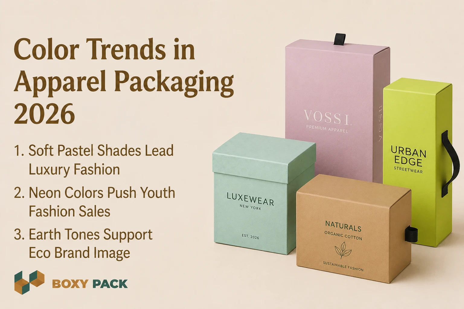
Soft Pastel Shades Lead Luxury Fashion
Luxury apparel packaging now uses soft pastel tones more often. These shades create a calm mood and a modern brand appeal. Many streetwear brands have avoided loud designs in recent launches. Matte finish styles also feel more rich in hand. Packaging design trends now focus more on buyer emotion than flashy graphics alone.
Neon Colors Push Youth Fashion Sales
Gen Z fashion labels prefer bright neon packaging for fast attention. Bold shades help products stand out during online unboxing videos. Gradient and soft tone blending effects also appear in many new collections. We now see brands testing color shifts under store lighting before large packaging production begins.
Earth Tones Support Eco Brand Image
Earth tones help sustainable apparel packaging feel honest and natural. Buyers often connect brown and olive shades with eco values. Luxury apparel boxes also use muted green themes for a clean brand look. Packaging design trends in 2026 now balance style with material awareness and real buyer trust.
Psychology Behind Packaging & Buying Behavior
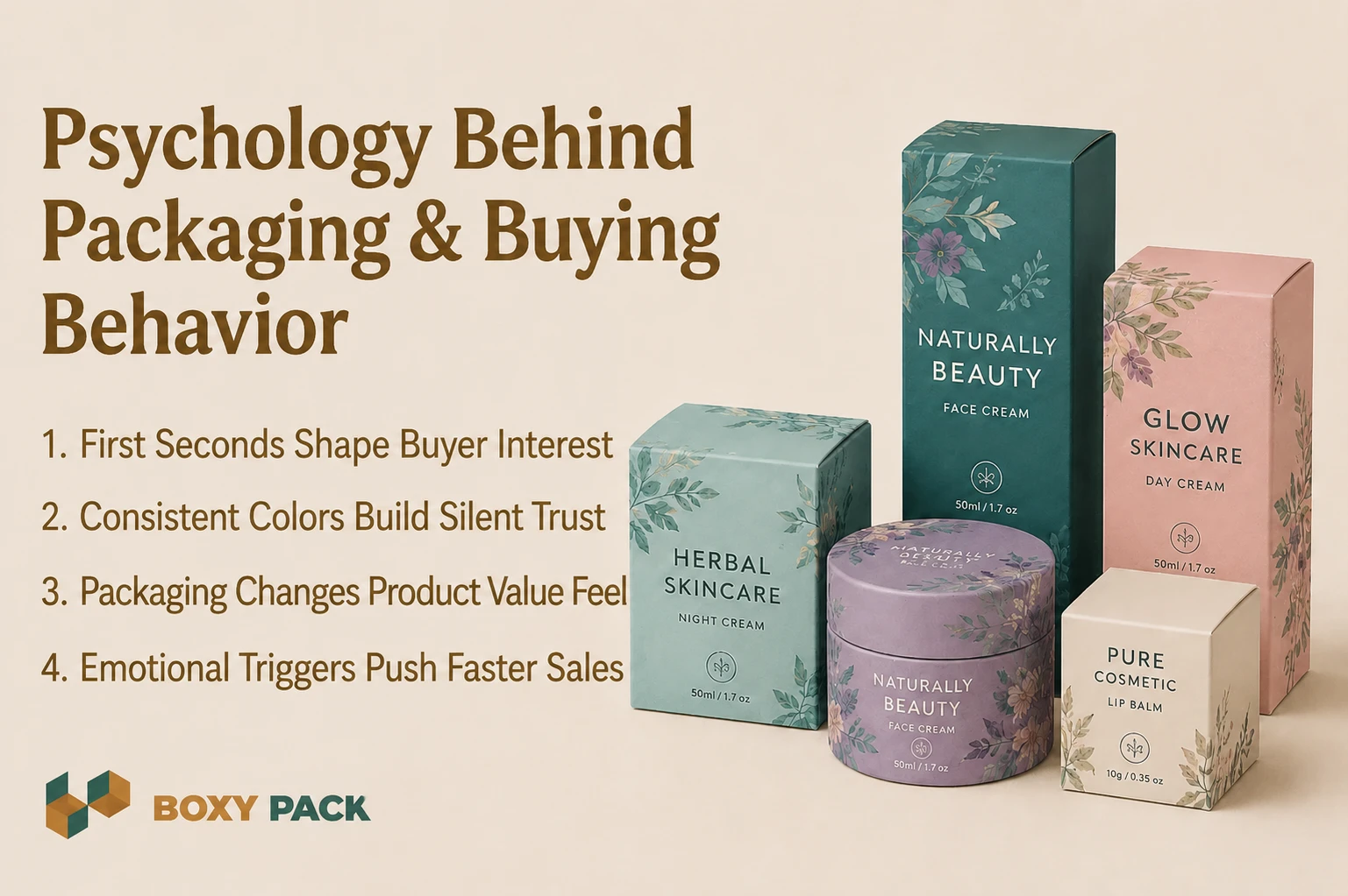
First Seconds Shape Buyer Interest
Retail packaging psychology starts working during the first few seconds. Buyers often judge apparel before checking product details or fabric quality. Strong packaging visuals increase early product interest in stores and online fashion pages today.
Consistent Colors Build Silent Trust
Color consistency helps buyers trust brands without much thought. Repeated shades create memory during future shopping visits and product searches. Consumer buying behavior packaging studies often show that stable visuals improve repeat customer response over time.
Packaging Changes Product Value Feel
Packaging affects how costly or cheap apparel feels to buyers. Matte textures and deep shades often signal premium product quality. Retail packaging psychology depends heavily on visual mood and clean presentation during product selection moments.
Emotional Triggers Push Faster Sales
Online shoppers rely on packaging visuals before making final decisions. Emotional color choices increase impulse buying during quick browsing sessions. Consumer buying behavior and premium packaging Wikipedia trends now shape sales conversion more because many buyers shop through product images first.
How Color Increases Apparel Brand Value
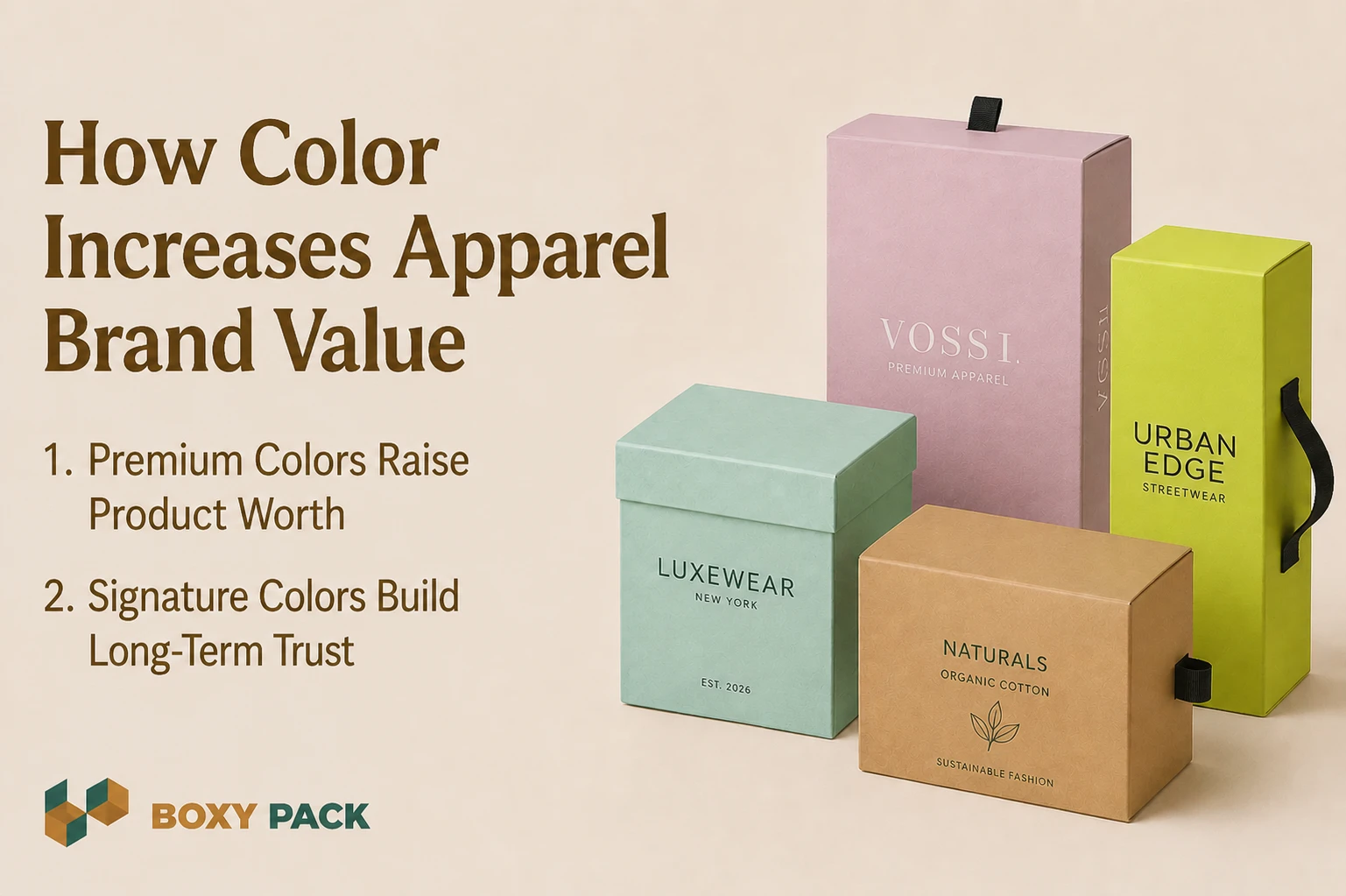
Premium Colors Raise Product Worth
Brand identity packaging shapes how buyers judge apparel value fast. Dark tones and matte finishes often make products feel more costly. Premium packaging boxes use balanced color harmony for rich visual appeal. Strong contrast also improves shelf visibility in busy retail spaces. We often test color samples under store lights before final printing begins.
Signature Colors Build Long-Term Trust
Signature colors help brands stay memorable during repeat shopping visits. Buyers often recall packaging shades before brand names in fashion stores. Brand identity packaging depends on clear and stable visual themes. Poor color choice can lower trust and reduce conversion rate during online and retail buying moments today.
Common Mistakes in Packaging Color Choice
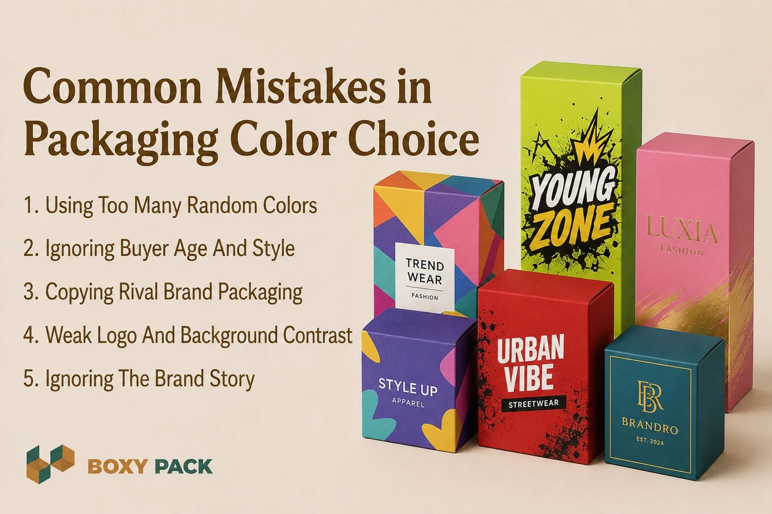
Using Too Many Random Colors
Many apparel packaging mistakes start with crowded color choices. Too many shades create visual stress for buyers. Packaging design psychology works better with simple and stable color balance during product display and online shopping moments today.
Ignoring Buyer Age And Style
Brands often forget the target audience's behavior during packaging planning stages. Youth buyers react differently from luxury fashion shoppers. Apparel packaging mistakes increase when brands choose colors without testing real customer response before launch day, especially for luxury clothing box designs.
Copying Rival Brand Packaging
Many fashion brands copy popular competitor color themes too closely. This weakens brand identity and lowers shelf difference in stores. Packaging design psychology depends on a unique visual memory that buyers can recall later.
Weak Logo And Background Contrast
Poor contrast makes logos hard to read during fast shopping moments. Buyers may ignore products with unclear visual focus. Apparel packaging mistakes like this quietly reduce product trust and online click interest over time.
Ignoring The Brand Story
Packaging colors must support the full brand message and mood. Random color use creates confusion during product selection. Strong visual stories help fashion brands build better long-term customer trust.
Before vs After Color Strategy in Packaging
Before Weak Packaging Color Planning
Many custom apparel boxes fail because colors lack a clear brand meaning. Random shades create a weak emotional response during shopping moments. Fashion packaging boxes with poor contrast also lose shelf visibility in crowded stores. Buyers often forget generic packaging after the first product view. Weak visual trust usually lowers conversion and repeat customer interest over time.
After Smart Color Psychology Strategy
Strong color systems help brands build lifestyle and luxury appeal faster. Fashion packaging boxes with planned emotional tones improve buyer connection and recall. Custom apparel boxes and t-shirt box packaging also gain better online sharing through cleaner unboxing moments. High visual recognition across stores and social media builds stronger loyalty and supports better long-term apparel sales growth.
How Boxy Pack Creates Color-Driven Packaging
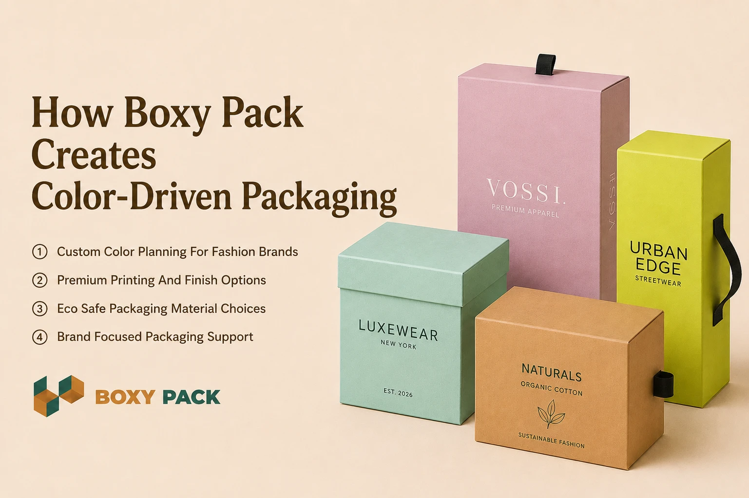
Custom Color Planning For Fashion Brands
Boxy Pack builds custom apparel boxes with real buyer emotion in mind. We study brand tone before final color planning begins. This helps packaging feel clear and trusted during the first product view. Many fashion brands struggle because packaging colors send mixed signals to buyers.
Premium Printing And Finish Options
We offer sharp printing with clean surface finish choices. Brands can choose matte gloss or soft touch styles for packaging. These finish options help apparel products feel more premium during unboxing and retail display moments across online and store sales channels.
Eco Safe Packaging Material Choices
Eco-friendly packaging design matters more to modern buyers now. We use color-safe materials that support clean print quality and lower waste goals. Many apparel brands now prefer earth tone packaging with simple finishes, while custom cosmetic boxes also follow this trend for better trust and a modern brand image.
Brand Focused Packaging Support
Our team guides brands through practical packaging color decisions. We test shades and finish samples before full production starts. This helps custom apparel boxes match real buyer expectations and long-term brand identity goals better.
Conclusion
Psychology Impact apparel packaging explains how colors guide buyer trust and product interest. This blog covered emotional color response and brand identity through packaging design. We also explored common mistakes and modern fashion packaging trends. Many apparel brands now test packaging colors before launch because visual reaction affects sales faster than product details during shopping moments, both online and inside stores today.
The main findings show that color psychology works like a silent sales tool for fashion brands. Smart packaging colors improve recall, trust, and long-term customer loyalty over time. Brands using strong visual systems often gain better shelf attention and online clicks. Future apparel packaging will focus more on eco-safe materials, emotional buying response, and clean, digital-friendly packaging experiences for modern fashion shoppers, aligned with Boxy Pack standards.
FAQs
Q1: Why is color important in apparel packaging?
Color shapes the first feeling a buyer has. A good color builds trust before they open the box.
Q2: Which color is best for luxury clothing packaging?
Black or deep charcoal gray works best for high-end clothes. Gold foil adds a nice touch, too.
Q3: Does packaging color affect sales?
Yes, I have seen it change sales by nearly twenty percent. The same product sells differently in a new color.
Q4: What colors are best for eco-friendly apparel brands?
Olive green and warm brown feel honest and natural. Stay far away from neon or plastic-looking greens.
Q5: Can small brands use color psychology in packaging?
Yes, just pick one bold color and stick with it. That beats using five random colors every time.
Ready to Get Started?
Discover our custom packaging solutions and bring your brand to life with premium boxes.